Switch
El switch ( "Interruptor" de encendido / apagado). Se utiliza para cambiar rápidamente entre dos estados posibles. Se utilizan comúnmente para estados de "encendido / apagado". Deben proporcionar resultados inmediatos, dando la libertad a los usuarios de controlar sus preferencias según sea necesario. El switch muestra cambios inmediatos, tal cual lo hace un botón de encendido o un interruptor de luz, se debe considerar para utilizar sólo en casos así donde no haya que realizar otra acción antes de ver una modificación, como apretar un botón “guardar”.
Playground
Label del Switch
texto de helper
- Ruby
- Html
- Groovy
app/widgets/widget/switch.erb
    <%= switch_widget switch_key: 'key' ,
                                      switch_label: 'Titulo Switch'    ,
                                      switch_helper: 'texto helper'
    %>
<div class="switch">
  <div class="switch__content" data-option="new_experience">
    <div class="custom-control custom-switch p-0">
      <input type="hidden" name="new_experience" value="false">
      <input type="checkbox" name="new_experience" class="custom-control-input" id="new_experience" value="true"  >
      <label class="custom-control-label" for="new_experience" id="status_new_experience"></label>
    </div>
    <div class="form-label-wrapper">
      <div class="d-flex align-items-center">
        <div class="switch__title" for="new_experience">
              <h3 class="switch__label text-truncate mb-0" data-overflow-tooltip="true">
                true
              </h3>
            </div>


      </div>
      <p class="switch__helper">true</p>
    </div>
  </div>
</div>
<g:switchComponent
        id=""
        class=""

/>
lista de parámetros
- Ruby
- Groovy
| Propiedad | Tipo | Detalle |
|---|---|---|
| switch_key | String | id del switch |
| switch_label | String | Para agregar título al widget |
| switch_activated | Boolean | Define desde el inicio si el switch está activado o no |
| switch_popover | String | Muestra información con un popover |
| switch_tooltip | String | Muestra un tooltip en el switch |
| switch_helper | String | Agrega un helper-text como ayuda contextual |
| switch_disabled | Boolean | Cambia el estado del switch a deshabilitado |
| switch_status_disabled | String | Agrega un tooltip dentro del switch para explicar el motivo por el cual está deshabilitado |
| Propiedad | Tipo | Detalle |
|---|---|---|
| id | String | Determina el ID dentro del DOM del componente |
| class | String | Determina el CLASS dentro del DOM del componente |
| checked | checked | Determina si está habilitado |
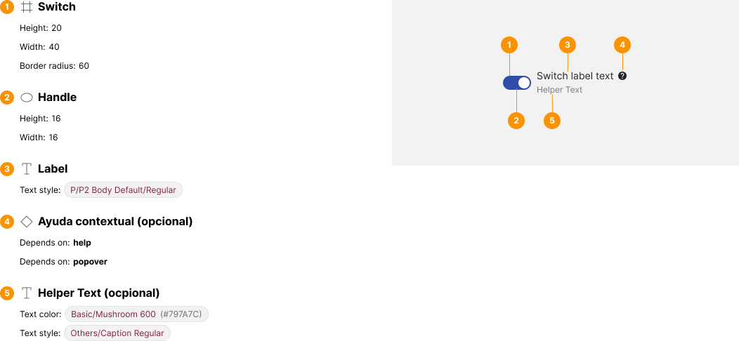
Anatomía
Do y Don't
